
Enrollment for Amazon Pharmacy
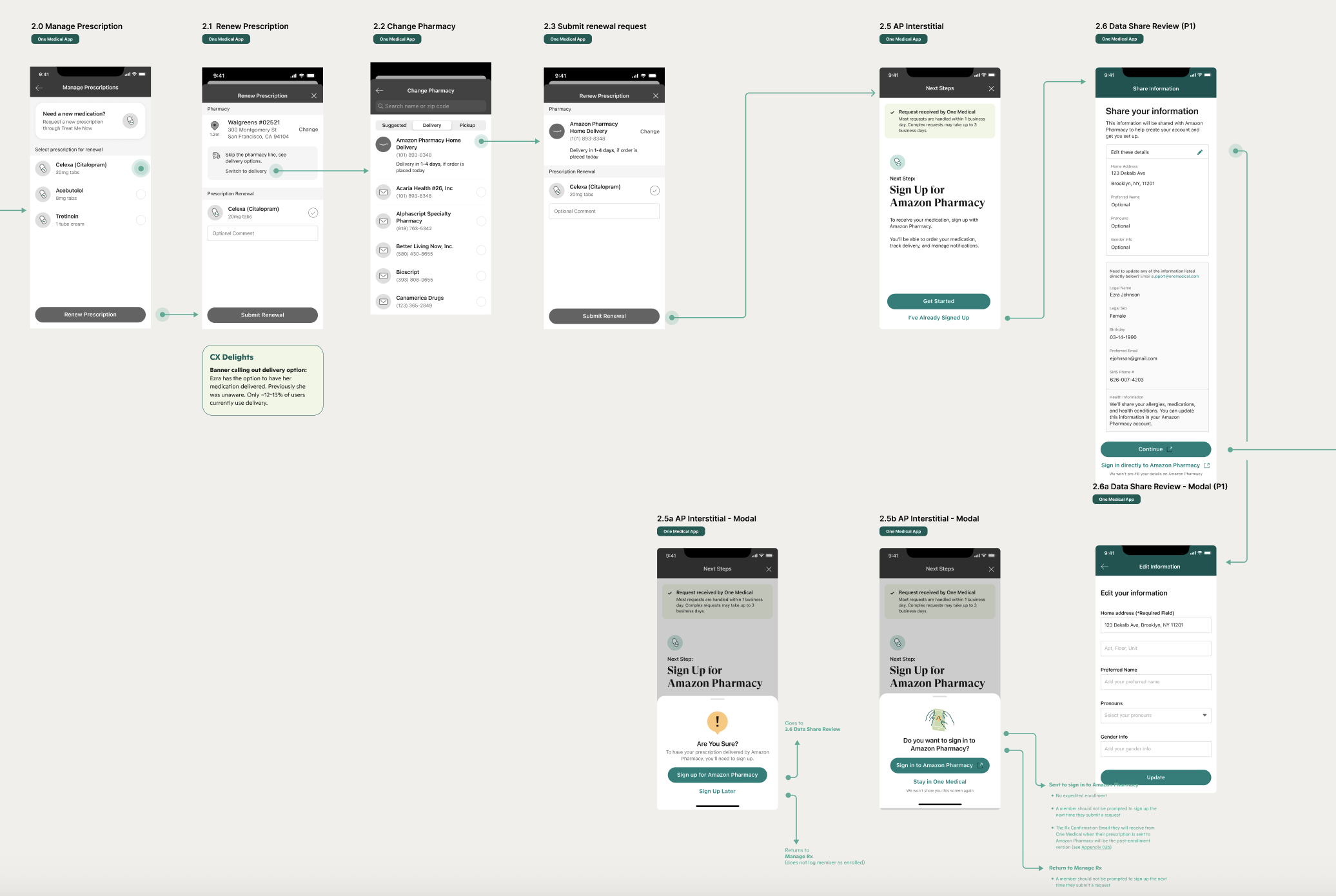
[User journey for enrollment]
Overview
Access to medication is time-sensitive, where delays or confusion during enrollment can impact adherence and overall health outcomes. One Medical members who opted to receive their medication from Amazon Pharmacy lacked awareness around next steps to ensure they received their medication in a timely window. They first needed to sign up for and create an account to be notified when their medication is ready for purchase. Additionally, the enrollment process was lengthy and redundant as it required them to manually re-enter their existing health information.
I led the design of a member-facing UI that proactively informed patients of the need to create an account and enabled them to share their existing health data to streamline the enrollment process.
Challenge
Patients enrolling faced three major issues:
Lack of awareness: Members were not informed that they needed to create an account to receive their medication
Lengthy enrollment process: Signing up for an account required manual entry of their existing health data
Potential delays in access: If a member did not create an account in time, they would not be notified when their medication was ready
The challenge was to redesign the interface so that patients could complete enrollment with less friction, greater clarity, and minimal back-and-forth.
Research & Insights
To understand patient pain points, I took the following steps:
Partnered with product, engineering and legal to understand both business constraints and technical requirements
Mapped the end-to-end workflow to uncover where potential bottlenecks and drop-offs could occur
Iterated on possible design options to ensure members understood the need to sign up and avoid drop offs
Key insights included:
Getting straight to the point — making it clear what was needed and what next steps a member could take
Providing options that allowed members to return to sign up at a later point in time
Inclusive form options that ensured members felt supported and seen when filling in their personal information, including preferred name and pronouns
Solution
I designed a patient-centered enrollment experience that emphasized clarity, progress, and reassurance:
Guided flow: Enrollment broken down into clear, sequential steps with visual progress indicators.
Simplified language: Plain-language instructions and tooltips to reduce confusion.
Confirmation & feedback: Inline validation and step confirmations reassured patients their input was correct.
Deliverables included annotated design mocks to support handoff and implementation.
Impact
Faster enrollment: Reduced the number of screens from 15+ to under 10
Greater patient confidence: Initial analytics showed increased confidence in completing enrollment
Business outcomes: Quicker enrollment resulted in an increase in total prescriptions sent to Amazon Pharmacy
Reflection
This project underscored the value of human-centered design in healthcare. By centering the patient experience, I was able to transform a confusing, frustrating process into one that was streamlined, supportive, and effective.
The work reinforced my belief that good design is not just about usability—it’s about trust, clarity, and reducing barriers in moments that matter most.
View Next Project
Optimizing for a New Audience
Responsive website for new members while ensuring ease of use for long-time, older members