
Enhancing Immunization History for Improved Clinical Decision Making
Comparison of existing and updated information architecture
Overview
Immunization history is one of the most common and critical pieces of information a provider needs during a clinical encounter. Yet in the EHR, vaccines were displayed in fragmented, inconsistent ways—making it difficult to quickly interpret whether a patient was up to date, overdue, or missing key doses.
I led the redesign of the vaccine display structure to make immunization histories easier to interpret at a glance, improving provider efficiency, patient communication, and ultimately, care decisions.
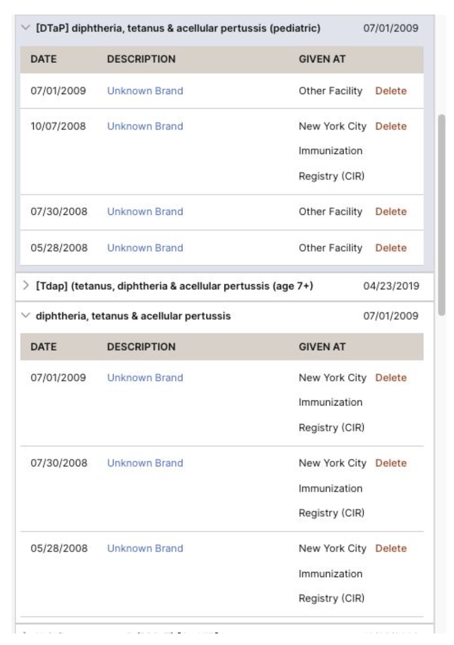
Existing display of immunization history that shows redundant entries
Challenge
Providers were frustrated by how immunization records were presented. The display lacked clear grouping or status indicators—forcing clinicians to scan through long lists and mentally reconstruct whether a series was complete.
This created three major challenges:
Cognitive load: Providers had to piece together information manually, which slowed down encounters and could lead to errors
Context Switching: Some providers utilized external sources of information to confirm existing history in a patient’s chart
Risk of missed care: Without clear signals, overdue or missing doses could easily be overlooked.
The challenge was to design a display that simplified complexity without oversimplifying critical clinical data.
Research & Insights
To understand provider needs and workflow pain points, I conducted:
User interviews with clinicians to capture how they interpret vaccine information in real-world encounters
Workflow mapping to see how vaccine history was used in context (e.g., during checkups or patient intake)
Data review with a clinical informaticist to understand how vaccine data was structured and how rules could be applied consistently
Key insights emerged:
Providers think in terms of series completion, not just individual doses
They need a clear signal for “up to date,” “overdue,” or “missing” or other status
Visual hierarchy and consistency are essential to reduce interpretation errors.
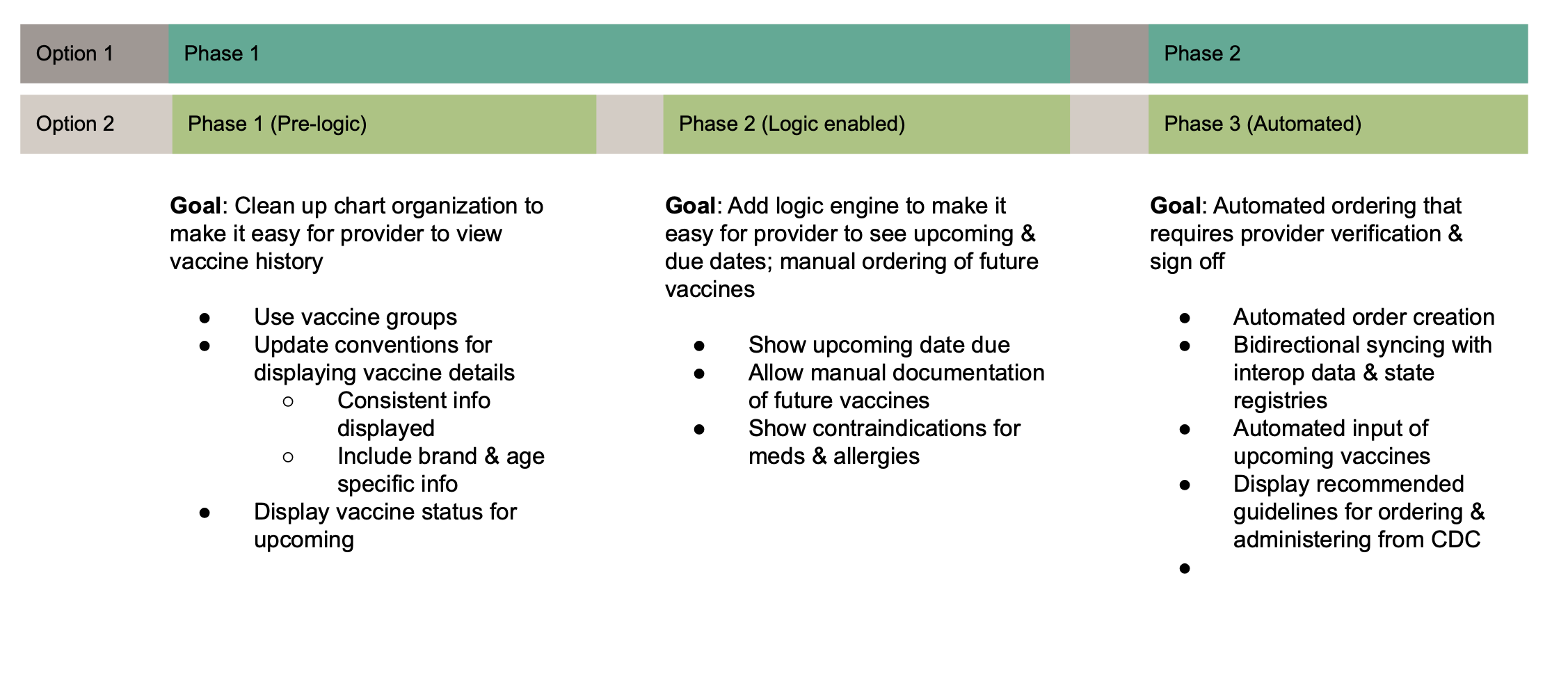
Breakdown of proposed phases for implementing updates
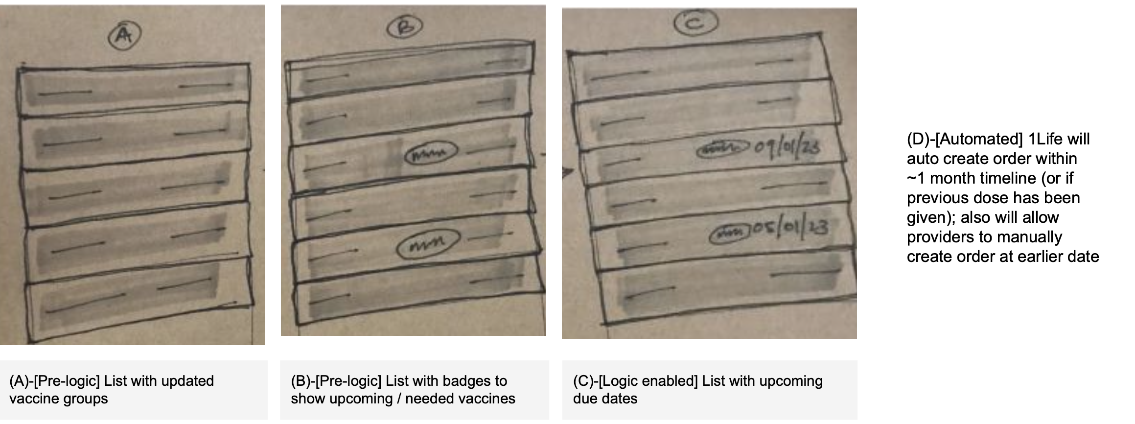
Sketch of how each phase could look with key info highlighted to show progression of improvements
Solution
I reimagined the vaccine display with a structure that better reflected provider mental models and workflows:
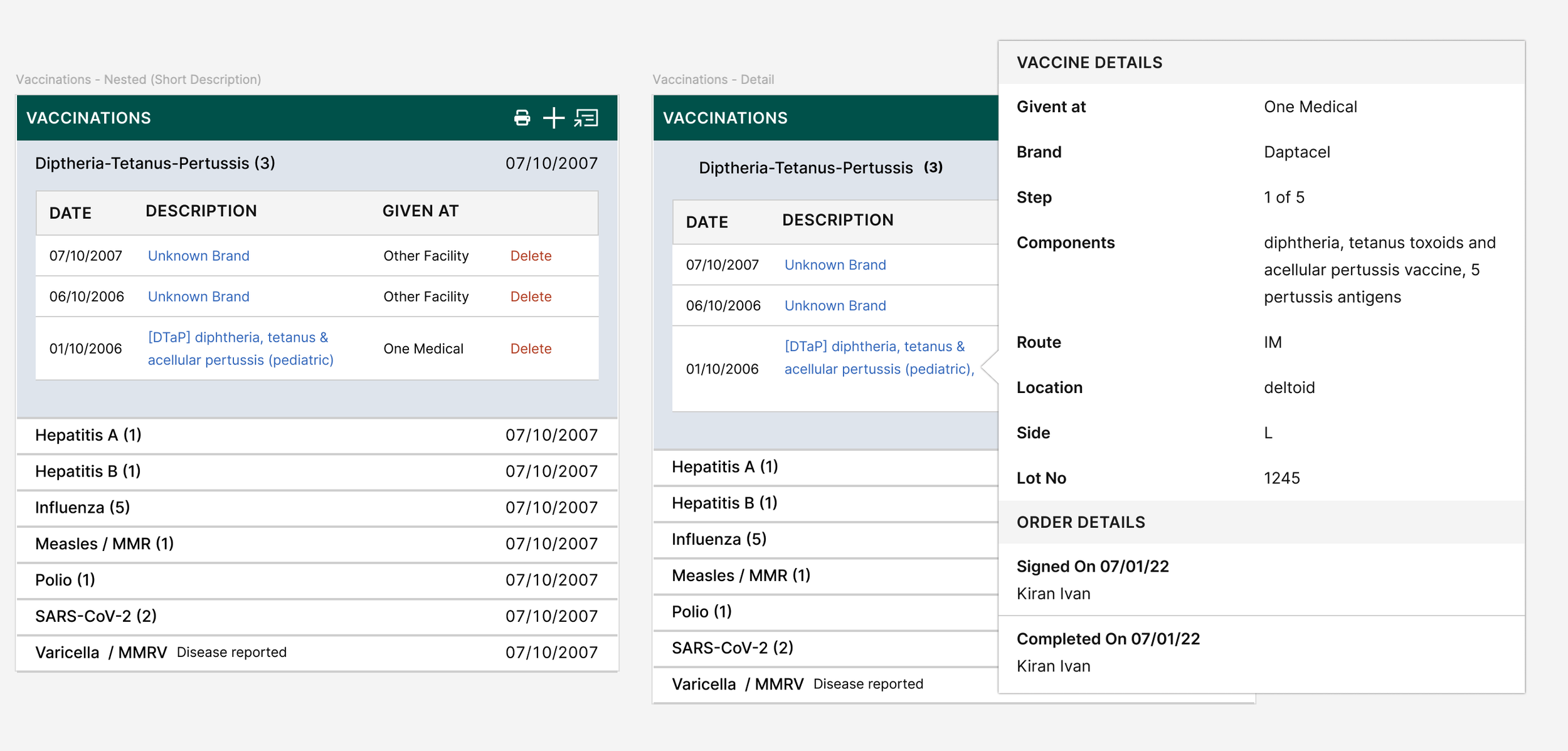
Grouped by series: Vaccines were organized into logical categories (e.g., MMR, Hepatitis B), making it easier to scan.
Completion status indicators: Clear labels and visual cues showed whether a series was complete, in-progress, overdue, or missing.
Streamlined hierarchy: A simplified layout reduced noise while retaining all critical information.
Scalable framework: The design system allowed new vaccines or series to be added without creating inconsistency.
Impact
Increased efficiency: Providers could interpret vaccine status at a glance, saving time during encounters.
Improved communication: Clear grouping and status indicators supported more confident conversations with patients and caregivers.
Better care outcomes: Surfacing overdue and missing doses reduced the risk of missed interventions.
System scalability: The flexible grouping logic created a sustainable framework for future vaccines.
Reflection
This project highlighted the importance of making sense of complexity through design. By grounding the solution in research and provider workflows, I was able to translate a messy, fragmented display into a tool that supported clarity, confidence, and patient-centered care.
For me, it reinforced the belief that thoughtful design isn’t just about aesthetics—it’s about reducing cognitive burden by making it clear what is known vs unknown to enable better decision making in moments that matter.
View Next Project
Reducing Barriers to Care: Simplifying Pharmacy Enrollment
Ensuring members receive their medication while minimizing confusion and delay